
The Power of Colour: How to Use It with Confidence (and Avoid Regret)
If there’s one design element I could talk about endlessly, it’s colour. Nothing influences your mood, energy, and perception of a space quite like it. The right shade can make a room feel bigger, calmer, warmer, or more alive. Get it wrong, and the entire space can feel off - even if everything else is perfectly designed.
But here’s the secret: there are no “good” or “bad” colours. Colour is an art form. It’s about context - how a colour works with light, materials, and, most importantly, how you want to feel in the space.
It’s also where I like to push my clients a little outside their comfort zone. Left to their own devices, many people default to “safe” neutrals. And by the way, I use neutrals a lot – you need them to allow for bolder colours around them. But even neutrals can be hard to get right. However, when you’re brave with colour - with a designer’s eye guiding you - the results can be extraordinary.
So, how do you choose colour with confidence (and avoid that sinking feeling of regret when the paint dries)? Here are some of my favourite tips:
- Test Colour Properly (Not Just on the Wall)
Never rely on a tiny paint swatch. Instead, paint your chosen colour on large A4 or A3 sheets, and move them around the room at different times of day. Light transforms colour - what looks calm and grey at 10am can feel blue or green by 5pm.
- Don’t Copy Someone Else’s Home
Just because you loved a colour in a friend’s house (or on Instagram) doesn’t mean it will work in yours. Every home has different light, orientation, and proportions. A north-facing bedroom in Surrey won’t carry colour the same way as a sunny living room in Spain.
- Start With the Mood You Want
Ask yourself: how do I want to feel in this space? Energised? Relaxed? Cocooned? That should guide your palette. For example, soft neutrals or greens often create calm, while deeper hues can feel intimate and dramatic.

See how restful this bedroom feels in this sage green

And how amazing and most regal this dining room looks in this purple aubergine colour
- Don’t Fear the Dark Side
One of the biggest myths in design is that small, dark rooms should always be painted light to “open them up.” In fact, I often go the opposite way. Instead of fighting the lack of natural light, I embrace it with moodier tones. Add layered lighting and thoughtful styling, and you get a cosy, cocooning atmosphere that feels intentional.
- Experiment With Colour Drenching
One of my favourite techniques is colour drenching - washing a room in the same colour across walls, ceilings, and woodwork. It creates a seamless, enveloping effect that feels both bold and sophisticated. When done right, it can make a space feel larger, calmer, and incredibly chic.
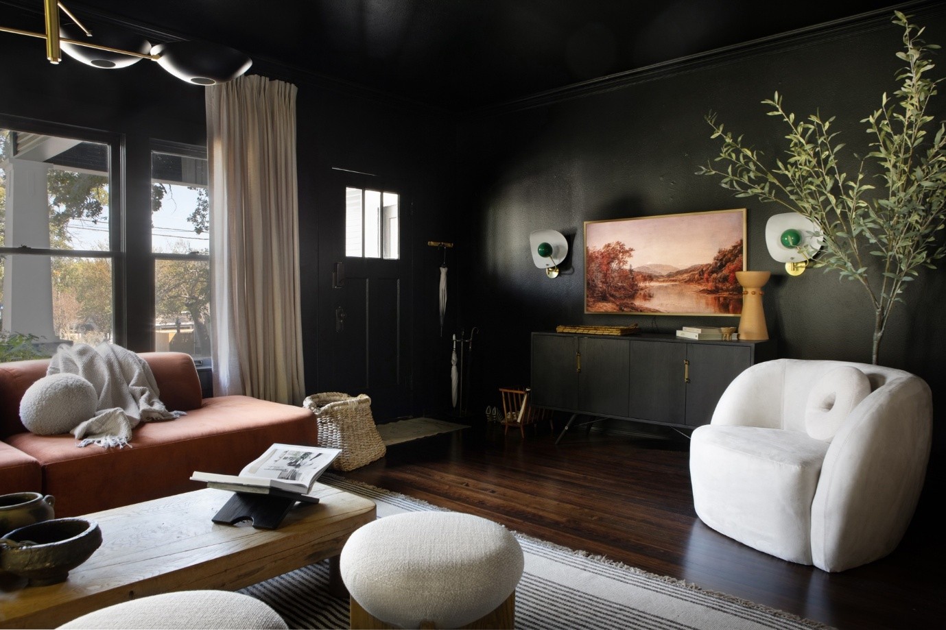
Doesn’t this room look amazing?
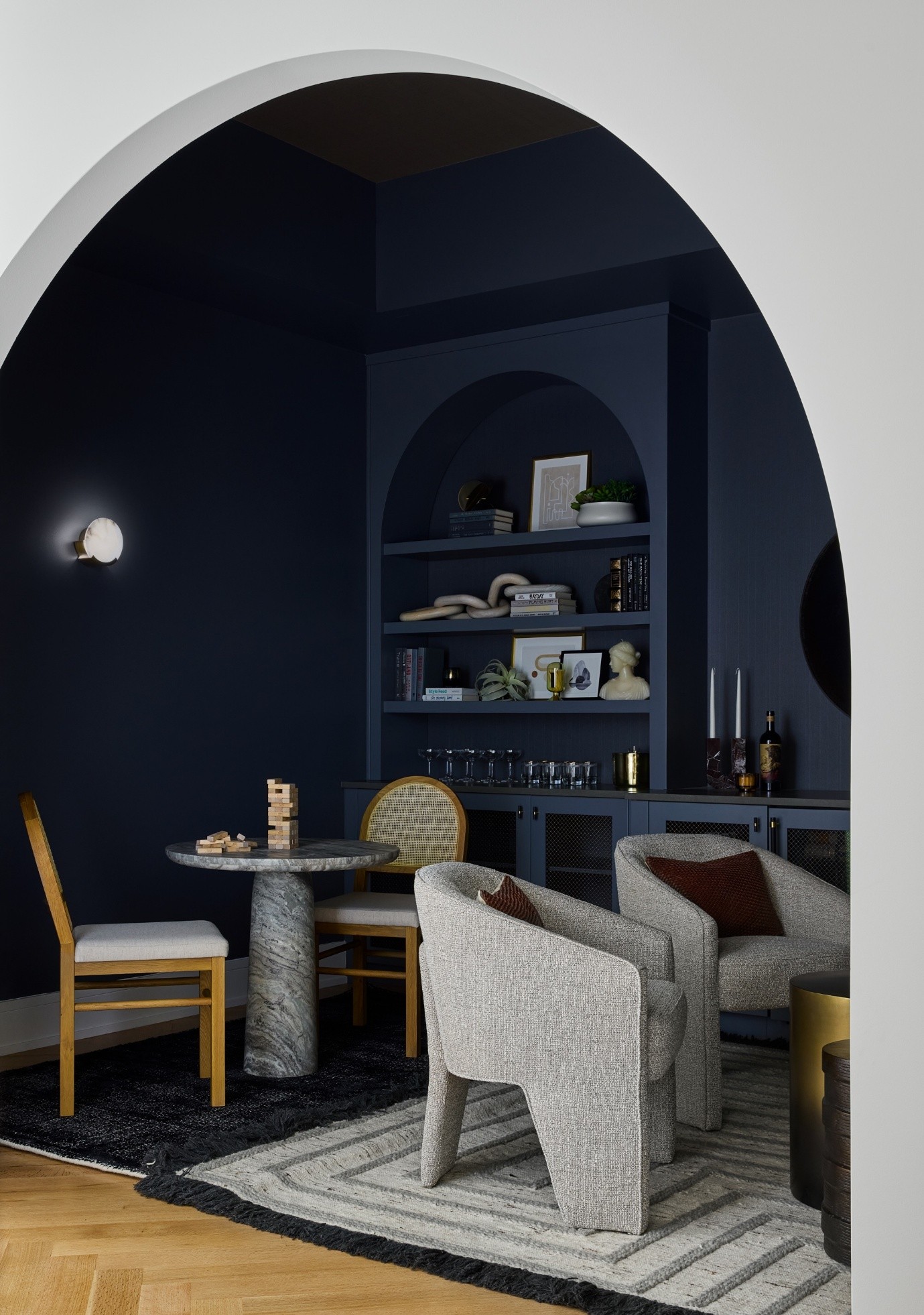
Or this cosy nook?
- Balance Colour With Lighting & Styling
Even the most beautiful colour can fall flat if the lighting isn’t right. Use a mix of ambient, task, and accent lighting to bring out the richness of your palette. Then layer in textures, artwork, and pattern to make the colour sing.
Final Thoughts
Colour has the power to create magic - or to ruin a space. It deserves care, thought, and a willingness to experiment. I obsess over colour in every project because I know it’s effect is transformational.
The best part? When my clients trust me to push them to be just a little braver than they would have been on their own, the results are always more rewarding than they imagined.
So if you’ve been playing it safe with colour, maybe it’s time to take a step into something bolder. With the right guidance, you’ll never look back.